Edge Fitness

Disclaimer :
This project is from our Architecture Class. It is not connected to Edge Fitness.
My Role: Lead App redesigner, advocating for the teams research and prototype process.
Team: 2 Graduates
Challenge:
Choose a popular app or website that students think needs better design. Investigate issues with it and create a better version using student research.
Summary:
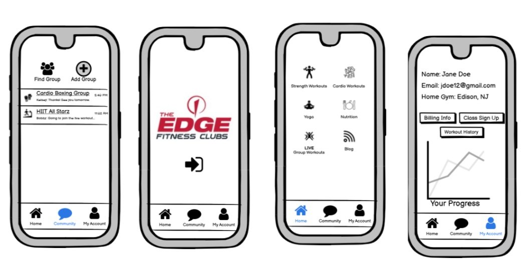
This project aims to review and improve the Edge Fitness Clubs mobile app for better usability and layout. The gym chain wants their app to offer online classes, class booking, and enhance the overall gym experience. Initial findings show that the current app layout is uninteresting and lacks motivation for users. We focused on fitness enthusiasts, particularly females aged 18-44, in our user testing and redesigned wireframes and prototypes based on their feedback. Our team recommended changes to the app for the company to succeed in this digital venture.

Problems Found:
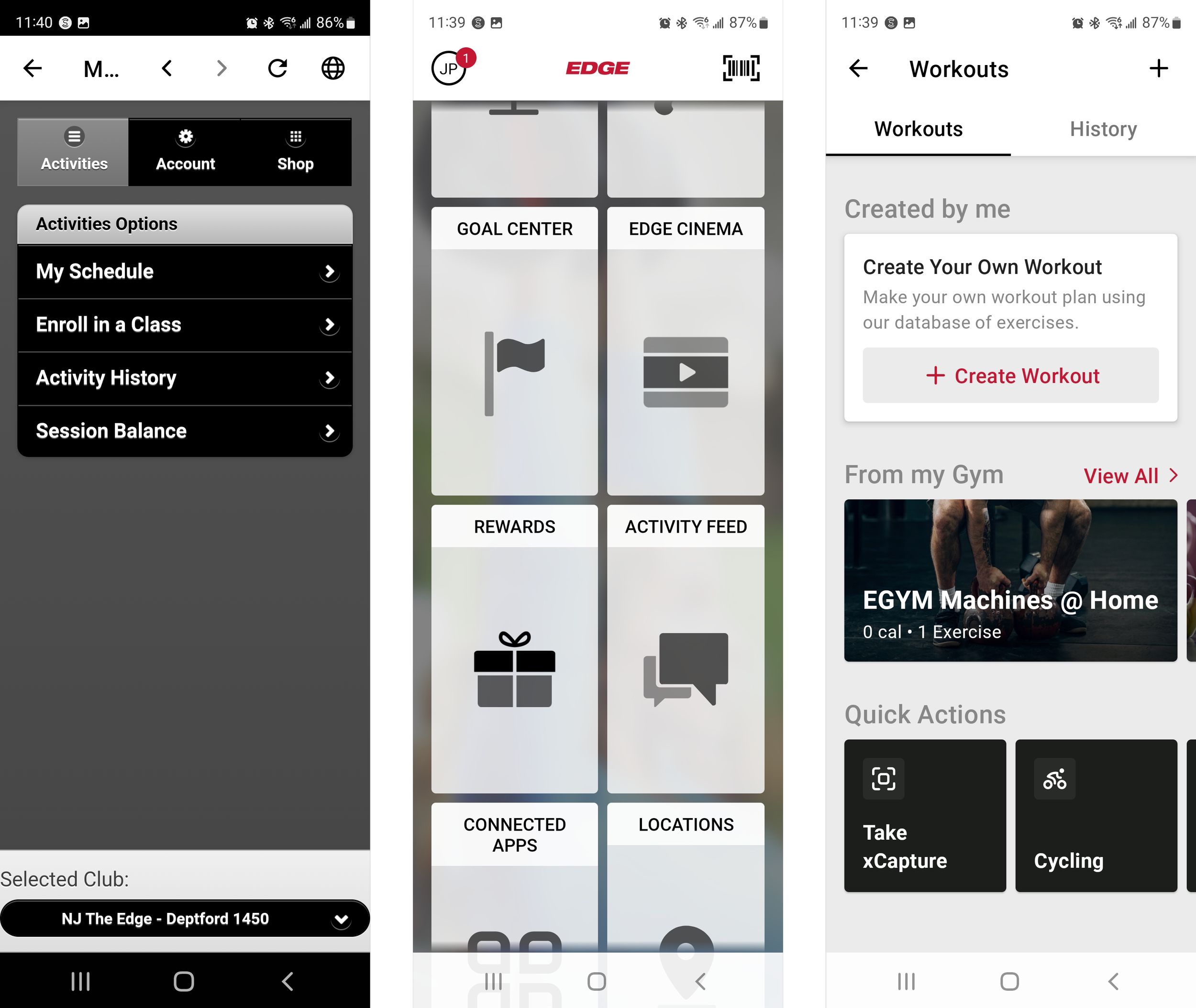
Original links on the app lead to the website.
Repetitive sign-ins in order to access certain functions of the app.
Multiple ways to access billing accounts.
Multiple ways to enroll in a class.
Not enough information on how to enroll for a Cinema Class.
Certain functions of the app are misleading.
Visual Assessment Testing
According to users, the mobile app seems very basic and uninviting. Emotionally, the app would not inspire somebody to go workout at the gym if they have not seen an Edge Fitness Club before. This may be unfortunate since the company advertises itself as an energetic and enjoyable place to workout. Although there are social features of the app, the layout and experience does not seem like a fun and attractive platform to use to engage with other Edge Fitness Club members or friends. The activity feed is very rudimentary and needs improvement as well if they would like to have more members interact through the app.
Personas

Design Studio


Clickable Testing
With our first test we found that some of the simple tasks that we asked of our participants had a mixture of difficulty to no difficulty at all. Tasks such as finding a workout, or reporting an equipment issue was a fairly easy and noticeable task for our users to complete. However, in further inspection we noticed that finding the membership card was a bit difficult, for those who don’t use the app often or at all would not have seen the little membership icon on the top right corner. Other findings such as finding a class by instructor had taken some of our users for a loop. Because Edge offers to find a specific instructor of your liking, those who don’t use the app are not aware they can find instructors from a specific location and then find a class they teach. Resulting in using the label “find a class” should either be changed to something else so that it is not misinterpreted.

Redesign Phase
Taking into account we have placed the membership card in a noticeable spot that increased from barely 10% of our participants to a full 100%. A big increase in approval for the app was finding other Edge locations within the area. This improved significantly once we implemented its own basic page. Participants have noticed that everything they need from finding a gym, to the specific location and best time to go has eliminated the frustration of looking for it through multiple clicks.